Cascading style sheets
Cascading styles (CSS) are applied to web pages to adjust their appearance, make them more readable, more attractive. CSS acts on the HTML elements, either directly from within the element tags (using the style attribute), or by being placed into the head of the page or on a separate, linked, style sheet. When not inside the element tag itself, a selector or identifier is used to identify which elements will be acted on, and properties define the styles themselves. The structure of a style is as follows:
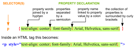
Notice that each property has a name and a value, separated by a colon, and each property is separated from its neighbours by a semicolon.
The various selectors, the way styles cascade and the bugs that different browsers have in interpreting the code make using style sheets an art.
There are many books on the subject that explain the intricacies and it is way beyond the capabilities of this site to provide a comprehensive guide. The tables below can be used to identify some of the properties that may be tweaked, and to understand the various selectors that have been used, and therefore where the properties have been applied.
| Selector type | example | application |
|---|---|---|
| tag, or element | h3 | all instances of the declared element. To apply to several elements separate them with a comma |
| class | .greentext | all elements with class="greentext" in the tag, classes are preceded by a dot |
| ID | #maintext | an element with ID="maintext" in the tag - must be unique to the page, note the # |
| contextual | li a |
apply to the last element only when it is (loosely) contained within the first element. Note there is a space but no comma between the selector tags |
| pseudo class (CSS2) | a:hover | applies to an element under certain conditions illustrated here by an element with the mouse over it |
| attribute | [attribute] | applies only when the tag contains the attribute or attribute/value in the square brackets |
| child | > | applies when second element is the direct child of the first |
| sibling | + | applies when the second element immediately follows the first |
Two kinds of linkage
| <link href="cssfiles/layoutstyles.css" rel="stylesheet" type="text/css" /> |
| <style type="text/css" media="all"> @import "layoutstyles.css"; </style> |
Some common properties
A good reference on the Internet is http://www.dhtmlgoodies.com/scripts/css-lookup/css-lookup.html
| name | example values and comments | applies to |
| background-attachment | scroll | fixed – sets background image to scroll with page or remain fixed | all elements |
| background-color | one of the 12 named colours| rgb(215, 0, 66) | rgb(0%, 50%, 3.5%) | #FF6653 | #746 – see color | all elements |
| background-image | url(imname.jpg) | |
| background-position | across and down from top left, act or % of visible area | |
| background-repeat | repeat | repeat-x | repeat-y | no-repeat | |
| border | set all 4 borders to same width, style, colour | |
| border-bottom | set bottom border width, style, colour (see border-width, border-style and border-color for values) not all need to be set | |
| border-bottom-color | one of the 12 named colours| rgb(215, 0, 66) | rgb(0%, 50%, 3.5%) | #FF6653 | #746 – see color | |
| border-bottom-style | dotted | solid | dashed | double | groove | ridge | outset | inset | none | |
| border-bottom-width | thin | medium | thick | [value + mm | cm | in | pt | em | px | %] | |
| border-collapse | collapse | separate – determines whether there is a gap between cells in a table. If all tables are same in document can set in body | table |
| border-color | one of the 12 named colours| rgb(215, 0, 66) | rgb(0%, 50%, 3.5%) | #FF6653 | #746 – see color | |
| border-left | set left border width, style, colour (see border-width, border-style and border-color for values) not all need to be set | |
| border-left-color | one of the 12 named colours| rgb(215, 0, 66) | rgb(0%, 50%, 3.5%) | #FF6653 | #746 – see color | |
| border-left-style | dotted | solid | dashed | double | groove | ridge | outset | inset | none | |
| border-left-width | thin | medium | thick | [value + mm | cm | in | pt | em | px | %] | |
| border-right | set right border width, style, colour (see border-width, border-style and border-color for values) not all need to be set | |
| border-right-color | one of the 12 named colours| rgb(215, 0, 66) | rgb(0%, 50%, 3.5%) | #FF6653 | #746 – see color | |
| border-right-style | dotted | solid | dashed | double | groove | ridge | outset | inset | none | |
| border-right-width | thin | medium | thick | [value + mm | cm | in | pt | em | px | %] | |
| border-spacing | only used for tables where border-collapse is set to separate. Use any length value; if two values takes first as horizontal | |
| border-style | dotted | solid | dashed | double | groove | ridge | outset | inset | none (does all 4 borders the same) | |
| border-top | set top border width, style, colour (see border-width, border-style and border-color for values) not all need to be set | |
| border-top-color | one of the 12 named colours| rgb(215, 0, 66) | rgb(0%, 50%, 3.5%) | #FF6653 | #746 – see color | |
| border-top-style | dotted | solid | dashed | double | groove | ridge | outset | inset | none | |
| border-top-width | thin | medium | thick | [value + mm | cm | in | pt | em | px | %] | |
| border-width | thin | medium | thick | [value + mm | cm | in | pt | em | px | %] | |
| bottom | ||
| caption-side | top | bottom | inherit determines whether a caption is displayed above or below a table | CAPTION |
| clear | none | left | right | both specifies on which sides a block element is not permitted to ride up alongside a floated element | block |
| clip | ||
| color | aqua black
blue fuchsia
gray
green lime
maroon navy
olive orange
purple red
silver teal
white yellow | rgb(215, 0, 66) | rgb(0%, 50%, 3.5%) | #FF6653 | #746 – sets the colour of text |
any |
| cursor | auto | crosshair | pointer | move | e-resize | ne-resize | nw-resize | n-resize | etc. | text | wait | help determines how the cursor is represented in the element | any |
| direction | ltr | rtl – governs the direction text appears along a line. Unlikely to be required as this will normally be done automatically | |
| display | inline | block | list-item | none | |
| empty-cells | show | hide – in the case of tables with separated cells this determines whether borders around empty cells will be displayed | table cells |
| float | left | right | none | inherit – the replacement for img align; allows an element to taken out of normal flow & placed to the left or right side | any |
| font | set all font properties(below) in one go, e.g. font: italic 1.3em arial; | |
| font-family | specific e.g. Arial, Courier, Times (put preferred first, separate with commas and put speech marks round families with more than one word) | generic e.g serif, sans-serif, monospace, cursive, fantasy | |
| font-size | mm | cm | in | pt | pc (pica) | em | ex | % | xx-small | x-small | small | medium | large | x- large | xx-large | larger | smaller | |
| font-stretch | ||
| font-style | normal | italic | oblique | |
| font-variant | normal | small-caps | |
| font-weight | normal | bold | bolder | lighter | 100 | 200 | 300 | 400 | 500 | 600 | 700 | 800 | 900 (higher values are more bold) | |
| left | ||
| letter-spacing | increases letter spacing (px or em) (can be negative) | |
| line-height | number (multiplies font size) | % ( multiplies font size) | mm | cm | in | pt | pc (pica) | em | ex use with caution | |
| list-style | allows a list to be defined in one go. See [type] [position] [image] below for values | |
| list-style-image | url("images/imagename.gif") can use absolute or relative addressing. If image is available, this overrides list-style-type | |
| list-style-position | inside | outside – sets the bullet or number to inside or outside the block | |
| list-style-type | circle | disc | square | decimal | upper-roman | lower-roman | none – sets the type of bullet or numbering | |
| margin | sets the amount of space around a block. values are set clock-wise starting top e.g. margin: 1em 2em; gives top & bottom spacing 1 em and right and left spacing 2 em. units: mm | cm | in | pt | pc (pica) | em | px | % of parent element width | auto | |
| margin-bottom | In a vertical direction, where two margins abutt, the shared margin will be made equal to the larger of the two constituent margins. | |
| margin-left | ||
| margin-right | ||
| margin-top | In a vertical direction, where two margins abutt, the shared margin will be made equal to the larger of the two constituent margins. | |
| max-height | ||
| max-width | ||
| min-height | ||
| min-width | ||
| padding | values will be set clock-wise starting top e.g. padding: 1em 2em; for top & bottom padding 1 em and right and left padding 2 em. units: mm | cm | in | pt | pc (pica) | em | px | % of parent element width | auto | |
| padding-bottom | ||
| padding-left | ||
| padding-right | ||
| padding-top | ||
| page-break-after | ||
| page-break-before | auto | always | avoid | left | right – instructs printer to start a new page before this element | |
| page-break-inside | ||
| position | ||
| right | ||
| text-align | left |center | right | justify | block |
| text-decoration | underline | overline | strike-through | none | |
| text-indent | sets first line indent to value inserted | |
| text-shadow | ||
| text-transform | capitalize | uppercase | lowercase | none – determines whether selected text is shown wholly in caps (uppercase) or init caps (capitalise) or not | |
| top | ||
| vertical-align | baseline | sub | top | text-top | middle | bottom | text-bottom | % (of line height) | mm | cm | in | pt | px sets selected text above or below the default baseline | inline |
| visibility | visible | hidden – when hidden the block does not display and the space is blank | |
| white-space | ||
| width | ||
| word-spacing | mm | cm | in | pt | pc (pica) | em | px | % – increases (or decreases if -ve) the spacing by the amount set (em is preferred) | |
| z-index |
Media queries
Use media queries to deliver a tailored style sheet to desktops, laptops, tablets, and mobile phones.
The @media rule is used in media queries to apply different styles for different media types/devices, eg to set the background blue or hide an element when screen size is 600px or less:.
@media only screen and (max-width: 600px) {
body {
background-color: lightblue;
}
}
@media screen and (max-width: 600px) {
div.example {
display: none;
}
}
Media queries can be used to check many things, such as:
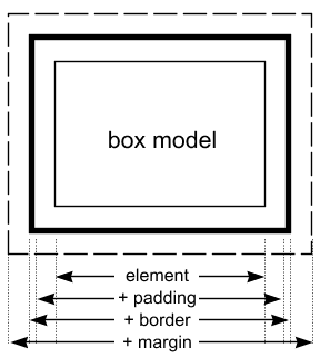 The
box model
The
box model